Falling interest rates and lower government bond yields have left an ageing population in search of other reliable sources of retirement income. Venturing into equities, riskier parts of the bond market and multi-asset income solutions are all avenues being pursued.
However, after the coronavirus sell-off, managing living expenses during retirement has become even harder, with many dividend payments being cancelled or curtailed and a rise in default risk creeping into areas of the credit market.
Here we explore new data points that can help to manage this income dilemma:
Don’t Just Focus on Yield
When your working years are behind you, deciding how to draw money from a retirement pot and/or live off the income it generates creates quandaries, not least the potential of one day running out of money.
One route for retirees is to hold assets that will generate some natural income. The need for income from investments is, therefore, understandable, but when buying a fund, investors are sometimes overly obsessed with the quoted yield.
But we believe that this is only part of the picture. It also shouldn’t be solely relied upon, not least because quoted yield is vulnerable to market movements, which is what we’re seeing today.
Given the recent stock market falls, strategies focusing on income are showing what might be perceived as an attractive yield, but it’s illusory. Dividends have been slashed but because yields are quoted on an historical 12-month basis, it gives no real indication of the upcoming direction of travel. That means investors need to dig deeper.
When Yield is Just an Illusion
Imagine a fund has an advertised yield of 5% and you invest £10,000. To deliver on its pledge, the fund must generate £500 of natural income from its underlying holdings.
Now imagine we see the fund generated only £450 of income but, at the same time, has eroded the capital by 10%, bringing your investment down to £9,000 by the year-end. In this case, the fund most certainly has maintained the quoted 5% yield, but your capital is down from where you started. And you received £50 less income than you’d anticipated to boot.
This shows how yield alone doesn’t paint a complete picture. Investors may be surprised to realise that even when the target yield is being met, they end up worse-off.
Investors should also be wary of offerings committed to a high level of distribution on a regular basis, though they may appear attractive when some parts of the market yield so little. In order to achieve the fund’s aim, managers an venture out into higher-yielding but often riskier parts of markets and alternative asset classes, impacting the fund’s overall risk profile.
How to Analyse Income
Morningstar has introduced an “Income Analysis” tool, which allows for deeper insights and graphics showing what happens to a lump sum in terms of change in its capital value and distribution amounts. This is particularly uses for comparing distributions across a fund’s different share classes, and can be used to compare income funds and search for those that pay a good, regular and hopefully growing income while also taking capital into account.
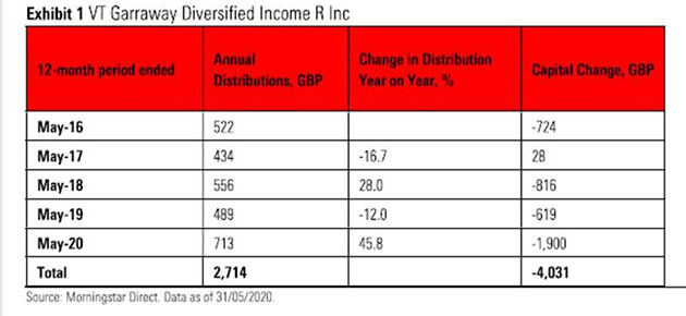
As an example, we look at the VT Garraway Diversified Income R Inc fund, which has a focus on delivering an attractive level of income and tends to have a bias to higher-yielding assets. It sits in the global flexible bond – GBP hedged Morningstar Category an the IA Strategic Bond sector.
The fund’s yield has risen to 12% (May 2020) from 7% (May 2016). This looks impressive however the below chart tells a fuller story and we can see that the income receive has yo-yoed year on year, while the capital base has fallen in four out of five periods.

Comparing Two Funds
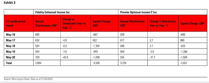
We have also looked at two funds in the UK equity income category as a another example: the Fidelity Enhanced Income Inc (with a 12-month yield of 8.5% at May 2020) and the Premier Optimum Income C (with an 8.75% yield).
These are both so-called “covered-call strategies”, which use derivatives to try and enhance their income pay out, but the nature of the approach means capital growth is, to an extent, restricted.
Crucially, while on paper their yields are similar, the below charts shows what would have happened if you had invested £10,000 in each at the end of May 2015.

Here we can see that Premier Optimum Income would have delivered a higher level of income payment during the time. But in the most recent 12 months, the Fidelity fund saw its distribution fall by more than 40%. Capital falls were similar across both funds, but tended to occur at different times, with the Premier fund notably suffering more during the most recent two-year period.
Actual Payouts are Important
For all these reasons, investors should rely less on the quoted yield figure and instead pay more attention to the actual pounds and pence they receive from their fund holdings. More important, the focus should then be on how stable that distribution has been over time, how sustainable it could be over their time horizon, and if it has kept up with inflation.


.jpg)


